Hi There.
I'm Beth. Thanks for stopping by.
Here's some recent work including
Web Design
Illustration
Logo & Identity Design
Hand Lettering
Want to work together? Shoot me an email:

Some other fun facts about me:

I teach people about typography over at TypeBurrito.com. I have written and illustrated 2(!) books about pooping for my toddler. My superpower is opening really difficult packaging. If you're still reading you deserve a cookie.

Hi There.
I'm Beth. Thanks
for stopping by.
Here's some
recent work
including
Web Design
Illustration
Logo &
Identity Design
Hand Lettering
Want to work together? Shoot me an email:

Some other fun facts about me:

I teach people about typography over at TypeBurrito.com. I have written and illustrated 2(!) books about pooping for my toddler. My superpower is opening really difficult packaging. If you're still reading you deserve a cookie.

Logo and Visual Identity Design

Lux Cantorum

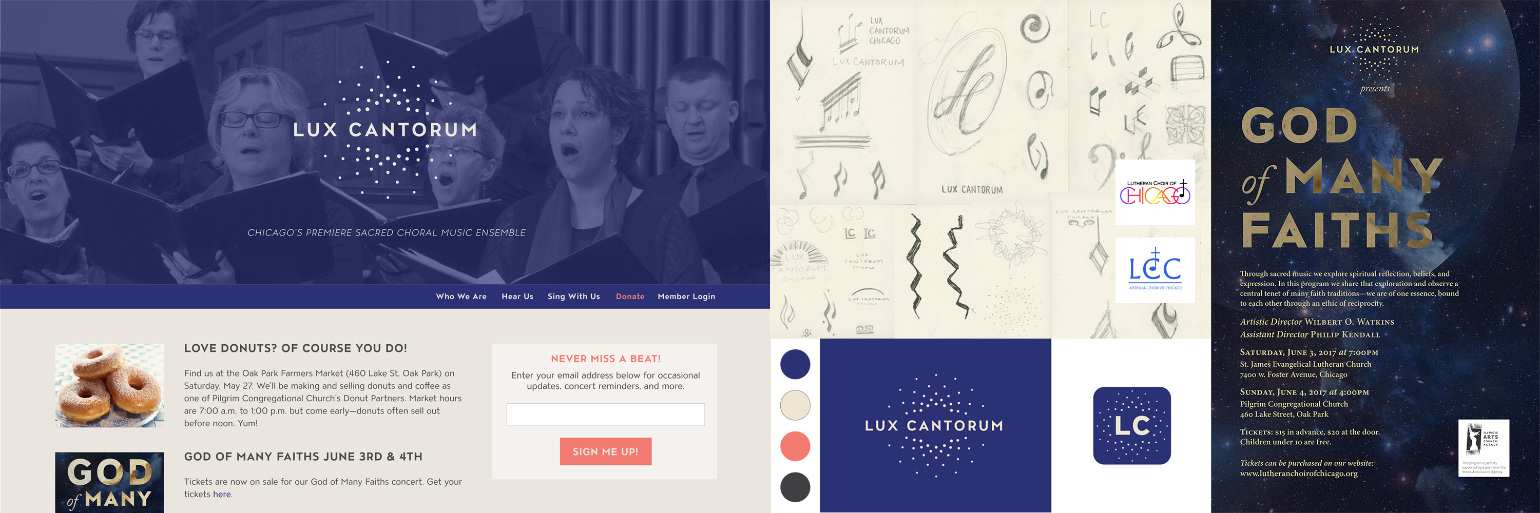
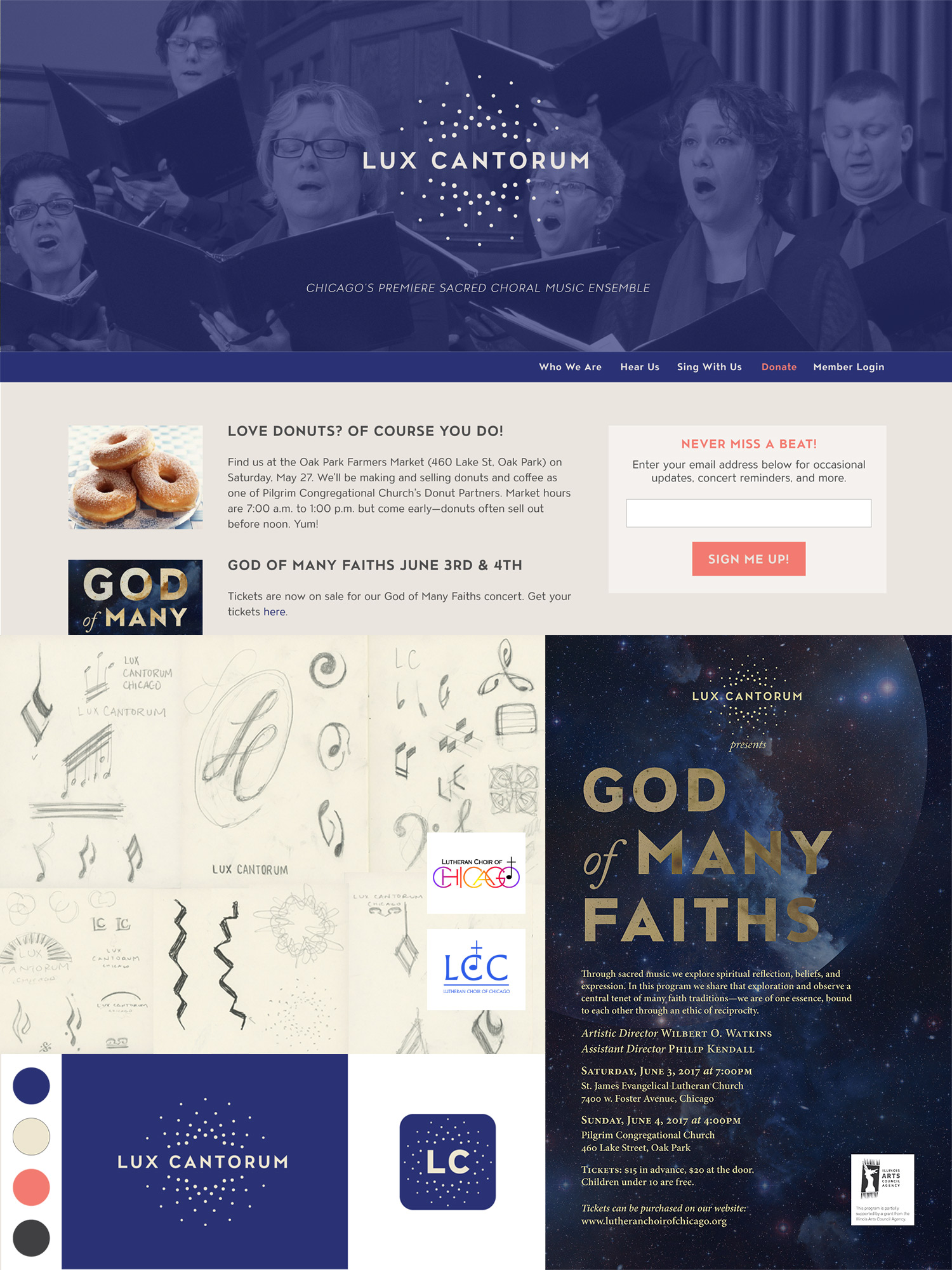
Lux Cantorum (roughly translated as singers of light) is the premiere sacred music choir in Chicago. Creating a logo for this organization was a balancing act—between religious and secular, young and old, rich history and new vision.

Lux Cantorum Logo

Formerly the Lutheran Choir of Chicago, Lux Cantorum underwent a name change to better align with their current values, vision, and membership, which they describe as "an inclusive, creative community sharing the the transformative power of sacred choral music." Although the choir's repertoire and membership is no longer Lutheran, they have a 70-year history singing sacred choral music, and it was important to preserve some continuity with this tradition.

In addition to communicating the choir's new mission, goals for the rebranding included increasing concert attendance, securing new sources of funding, and attracting younger, non-Lutheran members. It was necessary to move away from the overtly religious name and iconography of the old brand in order to achieve these goals, but at the same time, the sacred nature of the music continues to be an important part of what the choir embodies for both audiences and choir members. What both the name and logo seek to do is incorporate imagery (light, inclusion, interconnectedness) that speaks to those ideas without specific religious images. A dark shade of blue was chosen as the primary color in order to maintain a sense of continuity with the previous brand.

Logo Design

Swift Kick

Consultant and Trainer Kevin Griffin wanted to expand his business, and his previous moniker—Kevin Griffin Consulting—no longer made sense for the goals and direction of his business. Swift Kick provides software training, and Kevin wanted a logo that mirrored his approach to training: approachable but no-nonsense—a gentle kick in the pants to get professionals’ skills up to speed. The tongue-in-cheek, illustrative logo communicates the ethos of Swift Kick and also visually sets it apart from other training companies.

In addition to the logo, I provided a brand “starter kit” for Swift Kick by specifying colors and type choices to help the client maintain consistency across products, marketing materials, and website.

swift kick logo

Logo and Web Design

Type Burrito

Typography: a scrumptious combination of minutiae, craft, and science that makes my heart go pitter-patter. I started Type Burrito to teach designers and front-end developers about type. My goal is to provide high-quality resources to increase designers' skill and confidence with type.

The concept for the logo is fairly straightforward: the wordmark wraps itself like a burrito. A lot of designers and developers feel intimidated by typography, so it was important for the logo to feel accessible and not too overtly cool or trendy, which I learned from my audience adds to the sense of intimidation.

The design of the site itself is simple, and the focus is on the articles and resources. I’ve used pattern libraries for both consistency of design and ease of updating.

Type Burrito is a side project, and this is a first iteration which I plan to revisit. The focus for now has been on high-quality content (here’s an article I’m really proud of), which typically brings in 20-30K visitors to the site when I publish a new article. From just a few articles I have garnered over 700 sign-ups to my newsletter.

type burrito web site

What Clients Say

Beth was an amazing designer to work with!
She took the time needed to listen to what I knew my project needed, but also to help me explore some of the unknowns I was facing.

Kevin Griffin

—Kevin Griffin, Swift Kick

Want to work together?

Send me a quick email and tell me a bit about your project: [email protected].